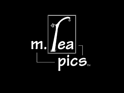
Here's a look at the development of my film moniker/logo, though I originally planned to just post the final image with a brief statement. As with all my vector art, I used Inkscape, plus this time elements borrowed from Sarah's Adobe Illustrator work.
First, the mock-up I made maybe in January '09 in MS Paint. :) (Maybe I'll get a better estimate on the date sometime.)
(click for big)

Next came the design my friend Sarah generously made for me. I asked her to create a vector image, using my mock-up as a basic starting point, but I also encouraged her to try something different, and use her own creativity. (Skip down to the first UPDATE below.)
Around the same time, I had one of my own in the works, (but "finalized" well after Sarah's) and except for the little fruit/drop I snagged from her design, it turned out almost exactly like the mock-up, except now in a clean vector format. Wasn't satisfied. Take a look.
Around the same time, I had one of my own in the works, (but "finalized" well after Sarah's) and except for the little fruit/drop I snagged from her design, it turned out almost exactly like the mock-up, except now in a clean vector format. Wasn't satisfied. Take a look.
I might be a weenie and forgo the neon colors in favor of plain white lines. [EDIT: Weenity confirmed. So anyway, looked at Sarah's version again, and I just couldn't help but admit hers was a more solid design. I still wanted to try some things of my own though, so... well, read the updates.] :)
As for its purpose, it will be appearing alongside Giant House Productions in at least one upcoming "film" currently under the title "Growing Up," that I co-funded, wrote, edited, directed, etc. with my bud Steve Huset who is representing Giant House. Other than that, its future is uncertain as I don't plan on pursuing this sort of thing anymore. I may still end up making videos of another breed, so it could possibly see more use, but that might even warrant a whole new logo, who knows.
I'll be back later with some cartoons or something. Bye!
UPDATE:
Check out Sarah's version!
(click for big)
Man this one is pretty cool, I'm having trouble deciding which to use. :P ...Or perhaps there could even be some sort of new amalgamation of the two if I decide its worth the time. In any case, mad props to Sarah for creating this, whatever its fate may be.
Look her up at:
www.mindelixirdesign.com
and
www.mindelixirs.blogspot.com
UPDATE 2:
OK wow, I had serious doubts when I mentioned the possibility of an amalgamation, but amazingly enough, here it is, the final version and totally reworked!
Allow me to go over some details for posterity's sake...
As you can see, it takes more from Sarah's design, specifically her modified font, making it sort of a collaboration between us. (Of course even with the text, I couldn't help making little tweaks to it.) I was going to leave the rectangle as just one thick line, but then I looked at her's again, and kind of liked the double line, so there's that too. Its pretty ultra-simple (minus some detailing in the "r") 'cause I decided to play it safe and leave out any color, or other additions I was tempted to make. Changing the two side lines into just one joining the text, leaves it less cluttered. (Though Sarah managed to make 'em work alright in hers.)
The shallow text shadow/3D effect thing supplies a bit of needed definition or refinement, but any more looked weird. (The word "pop," comes to mind, but I refuse to use it!) The "r" has obviously been changed as well, now with a weird swirl at the the top, and a stone pillar-like base. (There really isn't any symbolism here folks, I could easily make something up, but it would just be a lie!) ;)
Overall, its not a perfect design, but I'm much happier with this than my original version, so I'm glad that I didn't leave it how it was. Thanks for checking it out, and gimme a comment! :D


